The Color Theory Matrix: 24 Ways to Master Accessible Beige Kitchen Cabinets
Selecting the perfect neutral paint color for kitchen cabinetry is arguably the most terrifying, high-stakes decision in any residential renovation. If you choose a color that is too cold, the kitchen instantly feels like a sterile, depressing hospital cafeteria. If you choose a color that is too warm, the cabinets will inevitably cast a sickly, dated yellow hue that completely ruins the aesthetic of the entire house. Enter Sherwin-Williams Accessible Beige (SW 7036). This specific paint color has completely dominated the high-end interior design industry because it perfectly solves the neutral dilemma. It is the absolute ultimate ‘greige’—a flawless, highly calibrated mixture of warm beige heavily grounded by sophisticated gray undertones. This specific chemical balance ensures the cabinets look incredibly fresh, deeply modern, and richly historic all at the exact same time.
However, a paint color does not exist in a vacuum. Accessible Beige is notoriously known in the design industry as a ‘chameleon color,’ meaning its appearance shifts violently depending on the surrounding materials and the specific natural lighting of the room. You absolutely cannot simply slap this paint on your cabinets and expect a guaranteed masterpiece. To properly utilize this legendary color, we have structured this guide as a Color Theory Matrix. Instead of a randomized list, these twenty-four ideas are strictly organized into four critical application matrices: The Countertop Matrix, The Hardware Matrix, The Architectural Matrix, and The Lighting Matrix. By strictly following this bespoke, highly analytical framework, complete with material contrast tables and environmental checklists, you will flawlessly execute the ultimate Accessible Beige kitchen.
Matrix 1: The Countertop Pairings
The massive horizontal plane of your kitchen countertops will physically reflect light directly onto your painted cabinets. You must select a stone that perfectly complements the subtle gray undertones of Accessible Beige without clashing with its warmth.
Stark White Quartz Contrast
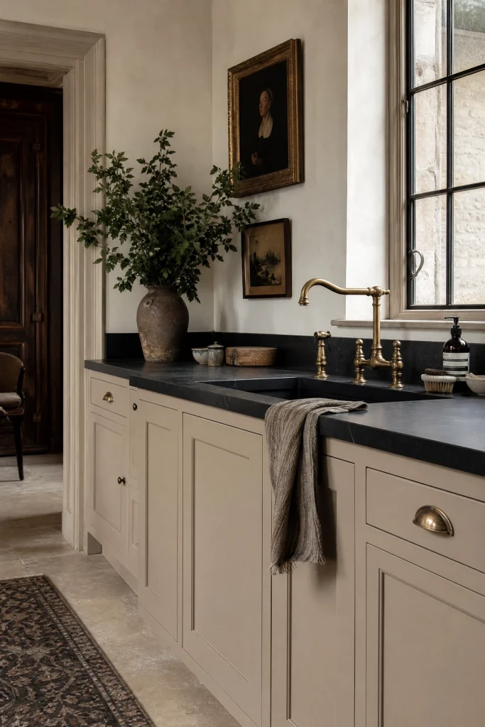
Pairing Accessible Beige cabinets with completely solid, stark white quartz countertops creates an incredibly fresh, highly modern aesthetic. The brilliant white stone violently cuts through the warm, earthy tones of the cabinetry, providing massive architectural tension and preventing the kitchen from feeling too heavy or muddy. Because Accessible Beige has an LRV (Light Reflectance Value) of fifty-eight, it provides enough depth to make the stark white countertops pop aggressively, establishing a clean, crisp visual boundary that screams high-end contemporary design.
| Quartz Type | Veining Color | Aesthetic Result |
| Solid Pure White | Zero Veining | Ultra-Modern & Sharp |
| Calacatta Gold | Warm Amber/Grey | Highly Luxurious & Transitional |
| Carrara Marble Look | Cool Blue/Grey | Clashes violently with warm beige |
Pro Move: If you choose stark white quartz, you must paint your kitchen ceiling and trim the exact same brilliant white to perfectly tie the cold stone into the surrounding warm architecture.
Honed Black Soapstone
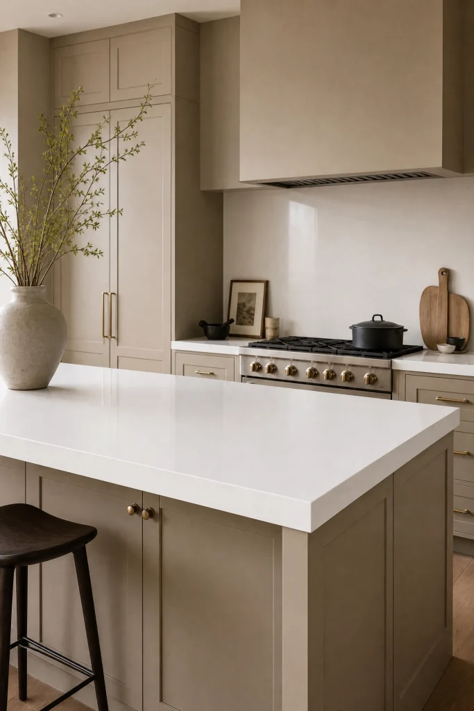
For a deeply sophisticated, historically rich, and intensely moody aesthetic, topping Accessible Beige cabinets with heavy, honed black soapstone is the ultimate designer choice. The flat, matte black stone provides a massive, heavy visual anchor that grounds the airy, light beige cabinets perfectly. This classic pairing mimics the high-end, bespoke kitchens of historic English estates. The warm gray undertones in the Accessible Beige paint perfectly bridge the gap between the warm wooden floors and the stark black countertops, creating a highly cohesive, dramatic environment.
Soapstone Maintenance Rules:
- You must actively oil the soapstone with mineral oil monthly to maintain the deep, dark black color.
- Soapstone is incredibly soft; you must never cut directly on the counter, as the knife will permanently gouge the stone.
- Use a matte sealant rather than a glossy sealant to maintain the historic, velvety texture.
Designer Advice: To prevent the kitchen from feeling like a dark cave, you must restrict the black soapstone strictly to the perimeter cabinets and use a bright white stone on the center island.
Warm Butcher Block Islands
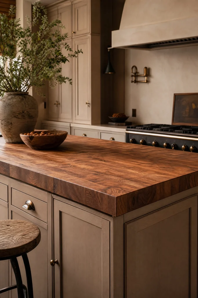
To heavily amplify the organic, earthy nature of Accessible Beige, utilizing a massive, thick walnut butcher block countertop on the center island is a brilliant strategy. The rich, fiery amber and deep brown tones of the natural wood seamlessly pull the warmest undertones out of the paint, creating a deeply cozy, highly welcoming environment. This specific material pairing introduces crucial tactile warmth and wabi-sabi imperfection into the room, perfectly offsetting the cold, hard surfaces of stainless steel appliances and glass windows.
Reality Check: Wood and water are mortal enemies; you absolutely must wipe up any standing water around the island sink immediately, or the expensive butcher block will instantly warp and turn a horrifying black color.
Taj Mahal Quartzite Integration
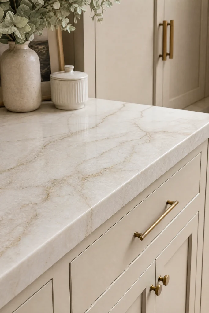
If your budget allows for extreme luxury, Taj Mahal quartzite is the absolute perfect natural stone to pair with Accessible Beige. This incredibly expensive, highly durable natural stone features a creamy, soft white background heavily laced with subtle beige, warm taupe, and pale gold veining. The colors in the Taj Mahal stone literally perfectly match the chemical makeup of the paint color, creating a seamless, monochromatic flow between the vertical cabinets and the horizontal countertops that looks incredibly bespoke and wildly expensive.
Quick Tip: Because Taj Mahal is a natural quartzite, every single slab looks entirely different; you must physically take a painted cabinet door sample to the stone yard to verify the exact undertones match perfectly.
Concrete Countertop Industrialism
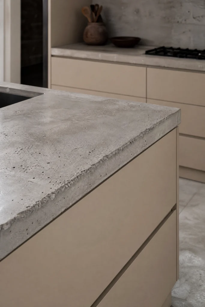
To instantly push Accessible Beige away from its traditional roots and force it into a highly modern, industrial aesthetic, pair the cabinetry with raw, poured concrete countertops. The cold, highly textural, imperfect gray concrete forcefully pulls the hidden gray undertones out of the Accessible Beige paint, transforming it from a warm beige into a stark, complex greige. This high-contrast pairing between soft, flawless painted cabinetry and brutal, raw industrial stone creates massive architectural tension favored by avant-garde interior designers.
Concrete Pairing Execution:
- Specify a very light, warm-gray concrete mix rather than a dark charcoal mix to prevent a depressing, heavy aesthetic.
- Ensure the concrete is polished to a highly smooth, matte finish to contrast the cabinet sheen.
- Seal the porous concrete aggressively with an industrial-grade epoxy to prevent massive oil stains.
Heads Up: Concrete countertops will inevitably develop tiny hairline cracks over time; you must embrace this wabi-sabi imperfection, or this specific material will cause you severe daily anxiety.
The Waterfall Edge Drama
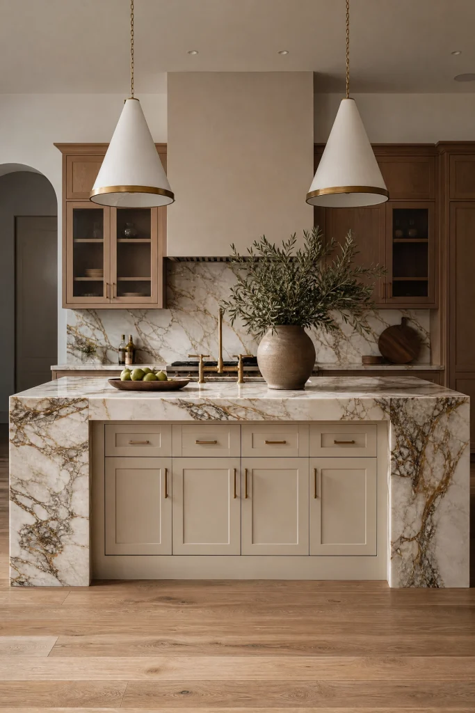
If you want to elevate standard beige cabinets into a jaw-dropping architectural masterpiece, install a massive countertop featuring a waterfall edge on the center island. This means the expensive stone physically wraps down the sides of the island, plunging straight into the floor. By flanking the Accessible Beige island cabinetry with massive slabs of heavily veined marble or quartz, you heavily frame the paint color, turning the wooden cabinetry into a highly curated, deeply luxurious focal point that anchors the entire room.
Pro Move: A waterfall edge requires you to purchase an entire additional slab of expensive stone; you must secure this budget early in the renovation planning phase before committing to the design.
Matrix 2: The Hardware Pairings
Cabinet hardware acts as the permanent jewelry of your kitchen. The specific metallic finish you choose will violently dictate whether Accessible Beige reads as a historic, traditional color or a sleek, ultra-modern hue.
Unlacquered Brass Warmth
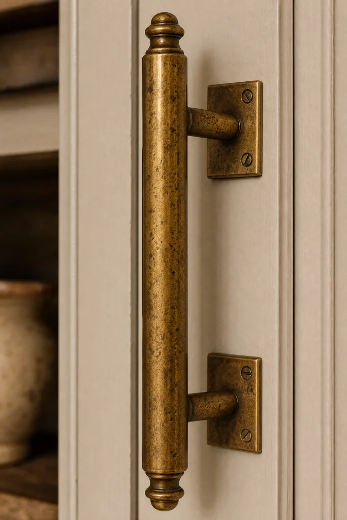
The absolute most heavily requested designer pairing for Accessible Beige is solid, unlacquered brass hardware. The bright, fiery golden tones of the brass perfectly harmonize with the warm beige base of the paint, creating an incredibly rich, highly sophisticated, and deeply romantic aesthetic. Over time, the unlacquered brass will naturally tarnish, developing a beautiful, dark, spotted patina that introduces massive amounts of history and bespoke character into a brand new kitchen.
| Brass Finish | Maintenance Level | Aesthetic Result |
| Unlacquered | High (Patina requires monitoring) | Living, historic, bespoke |
| Satin Brass | Low (Clear coated) | Modern, consistent, slightly sterile |
| Polished Brass | Low (Highly reflective) | Dated, shiny 1990s aesthetic |
Designer Advice: Never mix unlacquered brass hardware with cheap, shiny polished brass lighting fixtures; the conflicting metallic sheens will violently clash and make the entire kitchen look incredibly cheap.
Matte Black Modernization
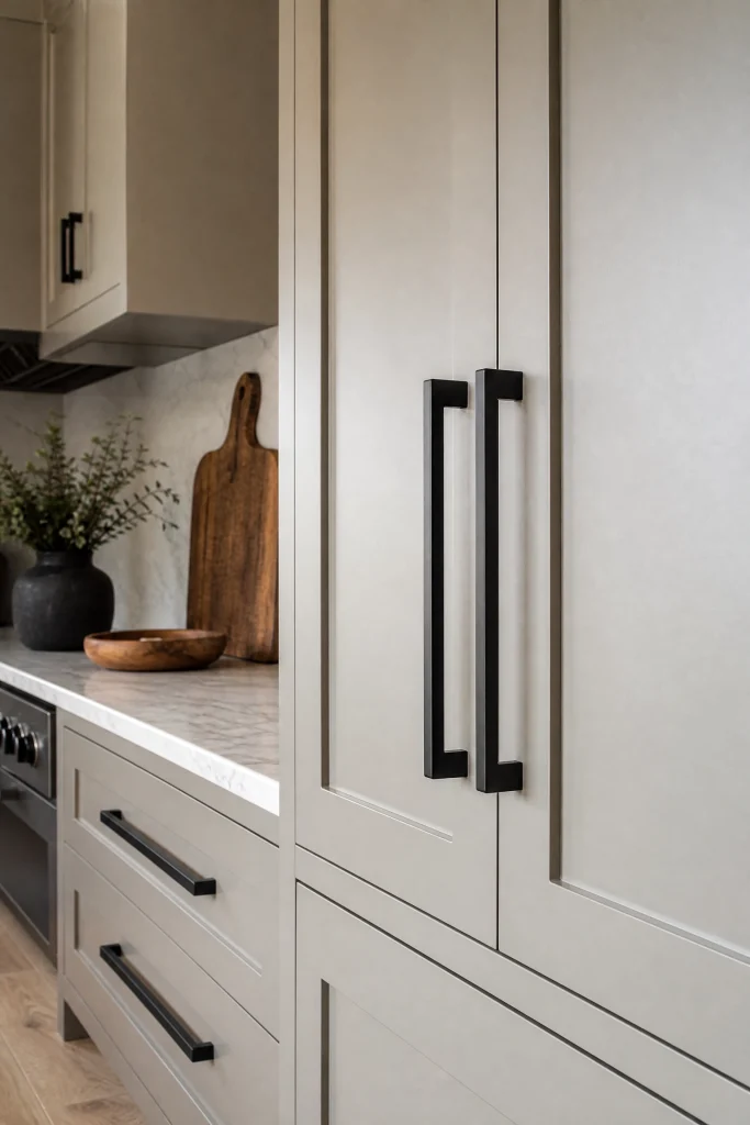
If you want to completely destroy the traditional connotations of beige paint, you must strictly install sharp, geometric matte black cabinet hardware. The stark, dead-flat black metal provides incredible, high-contrast punctuation against the soft greige paint. This aggressive contrast instantly modernizes the entire kitchen, making the cabinetry feel highly engineered, incredibly crisp, and deeply contemporary. The matte black handles act like sharp, tailored eyeliner, perfectly framing the soft color of the wood.
Matte Black Hardware Rules:
- Strictly utilize highly geometric, square bar pulls rather than rounded, traditional knobs.
- Match the matte black hardware perfectly with a matte black kitchen faucet to unify the aesthetic.
- Wipe the black hardware weekly, as it aggressively highlights white flour dust and oily fingerprints.
Quick Tip: Ensure your black hardware is powder-coated rather than simply painted; painted hardware will violently chip and reveal the cheap silver metal underneath within three months of daily use.
Polished Nickel Elegance
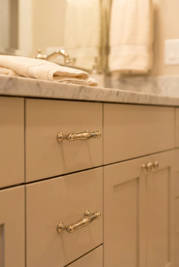
For a kitchen that requires a highly elegant, slightly glamorous, and deeply tailored aesthetic, polished nickel is the ultimate hardware choice. Unlike cheap chrome, which throws a cold, sterile blue light, polished nickel features a deeply warm, slightly golden undertone. This specific warm metallic reflection perfectly complements the beige undertones in the paint, creating a highly sophisticated, sparkling jewelry effect that elevates the perceived luxury of the cabinetry to boutique hotel status.
Reality Check: Polished nickel requires incredibly rigorous maintenance; you must wipe every single handle daily with a microfiber cloth, as it loudly displays every single water spot and fingerprint.
Leather-Wrapped Pulls
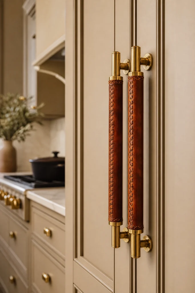
To introduce incredible tactile warmth and a highly unexpected, bespoke texture, consider utilizing heavy brass pulls tightly wrapped in dark cognac saddle leather. The rich, fiery orange undertones of the leather violently pop against the calm, neutral Accessible Beige paint. This highly specialized, incredibly expensive hardware choice brings a sophisticated, equestrian-inspired luxury into the kitchen, proving that you possess extreme attention to architectural detail and textural layering.
Heads Up: Never install leather-wrapped hardware on the cabinet directly under the kitchen sink, as constant splashing water and wet hands will quickly ruin the expensive leather.
Oversized Appliance Pulls
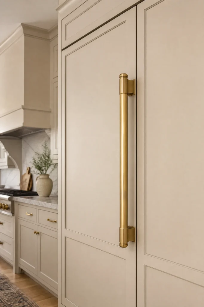
If your kitchen features massive, panel-ready appliances that are painted the exact same Accessible Beige as your cabinets, you must utilize massive, heavy-duty appliance pulls. Do not attempt to use standard cabinet handles on a heavy refrigerator door; the tiny screws will violently rip completely out of the painted wood. Utilizing massive, eighteen-inch solid brass pulls on your tall pantry doors and hidden refrigerator introduces incredible architectural scale and makes the cabinetry feel incredibly substantial.
Appliance Pull Installation:
- Verify the exact weight of the panel-ready refrigerator door when fully loaded with food.
- Purchase solid brass appliance pulls specifically rated for heavy commercial use.
- Drill massive clearance holes and bolt the handles entirely through the thick wooden panel for maximum structural integrity.
Pro Move: You must install the massive appliance pull at the exact same horizontal height as your standard lower cabinet handles to maintain a rigorous, flawless architectural line across the room.
The Invisible Handle Profile
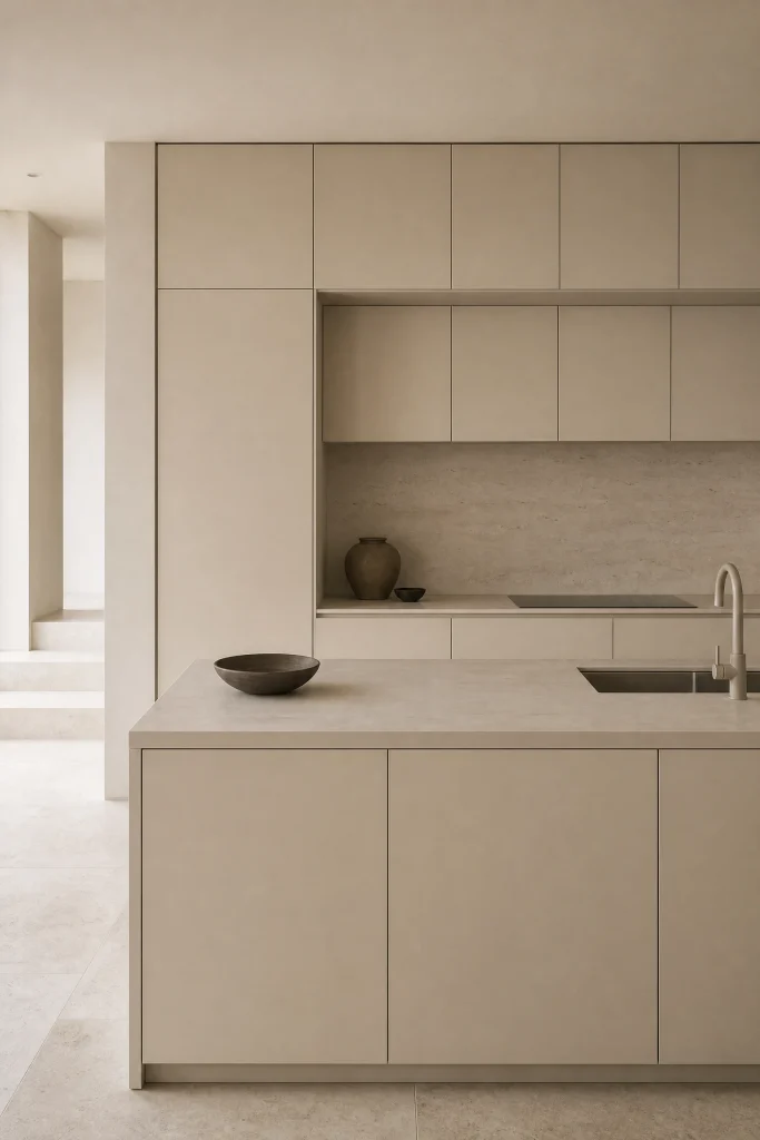
If you desire a hyper-minimalist, sleek European aesthetic, completely abandon decorative hardware and utilize routed finger-pulls or invisible edge-profile hardware. By completely eliminating the metallic jewelry, you force the eye to focus entirely on the flawless, smooth Accessible Beige paint and the stark geometric lines of the cabinetry. This aggressive, hardware-free approach is the ultimate modern statement, heavily relying on the sophisticated paint color to carry the entire visual weight of the room.
Designer Advice: Invisible hardware requires your hands to physically touch the painted wood every single time you open a door; you absolutely must use a highly durable, washable satin paint finish to prevent the doors from becoming disgustingly dirty.
Matrix 3: The Architectural Application
How and where you apply Accessible Beige is just as critical as the color itself. You must decide whether to completely drench the room in greige or use it strategically to anchor specific architectural elements.
The Two-Tone Tuxedo Kitchen
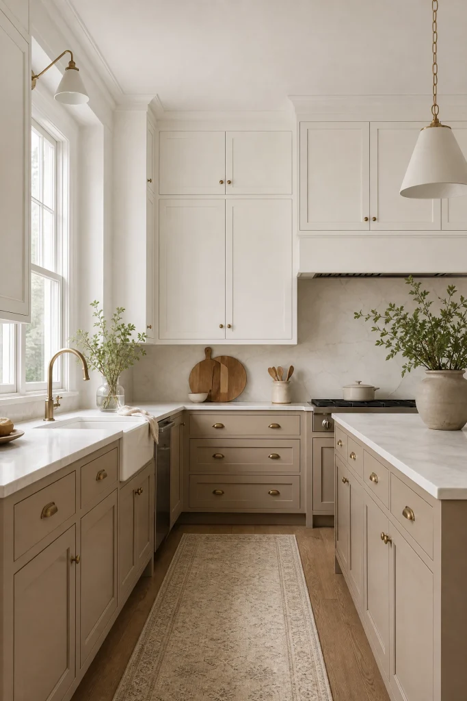
The absolute safest, most universally beloved architectural strategy is the two-tone kitchen. You aggressively paint all the heavy lower base cabinets in Accessible Beige, while painting all the upper wall cabinets in a crisp, creamy white like Sherwin-Williams Alabaster. The dark, grounded beige base heavily anchors the room, while the bright white upper cabinets visually melt into the white ceiling, creating an incredible optical illusion that makes the kitchen feel infinitely taller and significantly larger.
| Upper Cabinet Color | Contrast Level | Room Perception |
| SW Alabaster (Warm White) | Perfectly Balanced | Airy, tall, highly cohesive |
| SW Pure White (Stark) | Extremely High | Modern, slightly jarring |
| SW Accessible Beige | Zero Contrast | Moody, historic, deeply cocooning |
Quick Tip: If you execute a two-tone kitchen, you absolutely must install a brilliant white subway tile backsplash to perfectly bridge the gap between the dark lower cabinets and the white upper cabinets.
The Monochromatic Color Drench
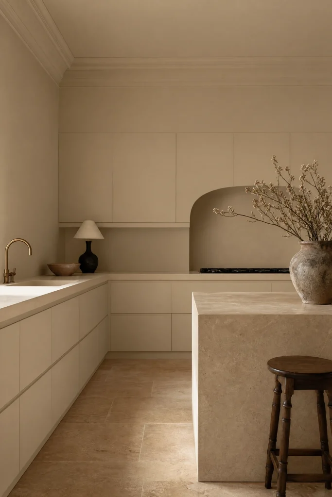
For an incredibly bold, highly avant-garde interior design statement, execute a complete monochromatic color drench. You must paint the lower cabinets, the upper cabinets, the kitchen walls, the baseboards, and the crown molding the exact same Accessible Beige color. By completely blurring the sharp architectural lines of the room, you create a deeply romantic, incredibly moody cocoon that feels highly tailored and incredibly expensive. This seamless envelope of color aggressively forces you to focus entirely on the textures of the stone and hardware.
Color Drench Execution Rules:
- Paint the cabinets in a durable Satin finish.
- Paint the drywall in a flat Matte finish to create subtle, complex shadow variations.
- Paint the heavy crown molding in a Semi-Gloss finish to heavily reflect ambient lighting.
Reality Check: Color drenching requires immense amounts of natural sunlight; if your kitchen is incredibly small and lacks large windows, this strategy will instantly turn the room into a terrifying, claustrophobic beige cave.
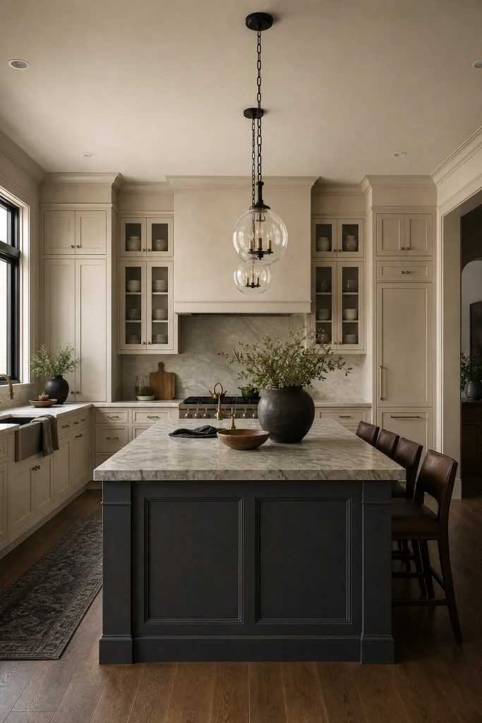
The Contrasting Dark Island
If you choose to paint your entire perimeter cabinetry in Accessible Beige, you can create massive architectural tension by painting the massive center island a deeply saturated, moody color like charcoal grey, navy blue, or forest green. The dark, heavy island acts as a massive visual anchor in the exact center of the room, completely preventing the abundance of beige paint from feeling monotonous or boring. This strategy proves that beige does not have to be safe; it can act as the perfect quiet backdrop for a highly dramatic centerpiece.
Pro Move: If you paint the island a dark color, you must utilize a bright white countertop on the island to bounce light upward, preventing the heavy dark wood from looking like a massive black hole.
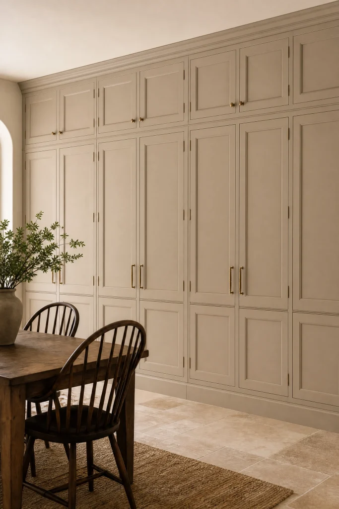
Floor-to-Ceiling Pantry Walls
If your kitchen features a massive, unbroken wall of floor-to-ceiling pantry cabinets, painting this massive architectural block entirely in Accessible Beige is a stunning aesthetic move. Unlike stark white paint, which would turn the massive wall into a blinding, sterile hospital corridor, the soft greige tone ensures the massive wall feels deeply warm, historically rich, and highly customized. The vast expanse of beige paint acts as the perfect, quiet backdrop for a beautiful dining table or a massive piece of abstract art.
Designer Advice: To break up the massive plane of solid beige wood, you must install at least one section of glass-front cabinetry in the middle of the pantry wall to introduce visual depth and display beautiful ceramics.
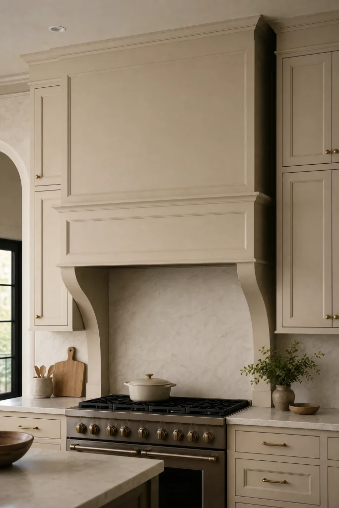
Matching the Range Hood
A massive stainless steel range hood can easily become a glaring, ugly industrial eyesore in a highly customized, warm kitchen. Instead, you must hire a carpenter to build a custom wooden hood surround and paint it the exact same Accessible Beige as your cabinetry. This seamless, highly tailored architectural detail completely hides the utilitarian metal machinery, transforming the cooking zone into a deeply sophisticated, beautifully integrated focal point that looks incredibly expensive and highly bespoke.
Custom Hood Execution:
- Ensure the wooden hood surround is physically built at least three inches wider than the cooking range below it.
- Install a highly powerful, hidden metal exhaust insert entirely inside the wooden shell.
- Seal the Accessible Beige paint on the hood aggressively with a high-heat, clear polyurethane to prevent steam damage.
Heads Up: You absolutely must verify your local building fire codes, which strictly dictate exactly how many inches of clearance are required between a wooden painted hood and the open gas flames below.
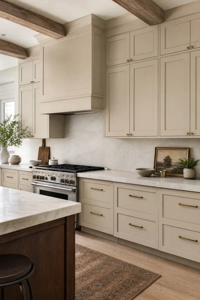
Extending Paint to the Ceiling
The absolute biggest mistake people make in kitchen design is leaving a massive, dark twelve-inch gap between the top of their cabinets and the ceiling. This awkward void completely ruins the architectural scale of the room and instantly collects terrifying amounts of greasy dust. You must hire a carpenter to install massive, heavy wooden fascia boards and crown molding to completely close this gap, and then paint the entire new structure Accessible Beige. This seamlessly extends the cabinetry visually to the ceiling, instantly making the room feel infinitely taller.
Quick Tip: If your ceiling is highly unlevel, the carpenter must carefully scribe the heavy beige crown molding to perfectly follow the crooked ceiling line, hiding the architectural flaw completely.
Matrix 4: Lighting and Environment Control
Accessible Beige is famously a chameleon color. You must aggressively control both the natural sunlight and the artificial electrical lighting in the room, or the paint will completely betray you and turn the wrong color.
Combating Northern Light (The Green Shift)
Kitchens featuring strictly North-facing windows receive incredibly cool, flat, bluish natural light. This specific light temperature interacts violently with the subtle gray undertones in Accessible Beige, frequently causing the paint to shift and look distinctly green or sickly grey. If your kitchen faces North, you must aggressively combat this optical illusion by utilizing highly saturated, warm-toned electrical lighting and heavily incorporating warm terracotta or red accents in your rugs and decor to visually neutralize the green shift.
| Window Direction | Natural Light Color | Accessible Beige Shift |
| North-Facing | Cool, Blue/Grey | Shifts slightly Green/Grey |
| South-Facing | Warm, Golden | Shifts deeply Beige/Warm |
| West-Facing (Afternoon) | Fiery Orange | Shifts extremely Warm/Rich |
Reality Check: You absolutely cannot buy twenty gallons of paint based on an internet photo; you must buy a tiny sample pot and paint a massive piece of cardboard, watching how the color shifts in your specific kitchen throughout the day.
The Perfect LED Temperature
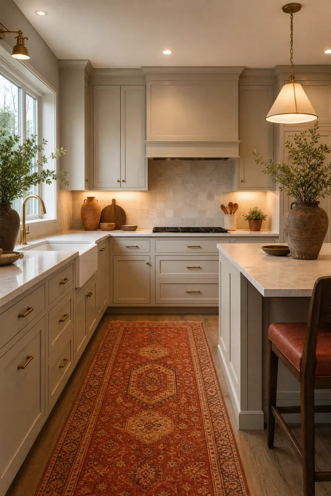
The electrical light bulbs you install in your kitchen will instantly dictate exactly how the cabinet paint looks at night. If you use cheap, cold 4000K or 5000K ‘daylight’ LED bulbs, the bright blue light will completely wash out the warmth of the beige, turning your expensive cabinets into a depressing, sterile grey. You absolutely must strictly utilize high-quality, 3000K warm-white LED bulbs in all your recessed ceiling lights and under-cabinet lighting. This specific temperature perfectly mimics warm afternoon sunlight, ensuring the Accessible Beige remains richly warm and highly inviting after the sun goes down.
Lighting Temperature Rules:
- Never mix 3000K and 4000K bulbs in the same room; the color clash is deeply nauseating.
- Ensure all under-cabinet LED strips have a CRI (Color Rendering Index) of 90 or higher for true color accuracy.
- Put every single lighting zone on a dedicated dimmer switch for maximum emotional control.
Pro Move: You must physically check the specific Kelvin temperature printed directly on the base of every single light bulb before installing it to guarantee perfect, flawless uniformity.
Managing Surrounding Reflections
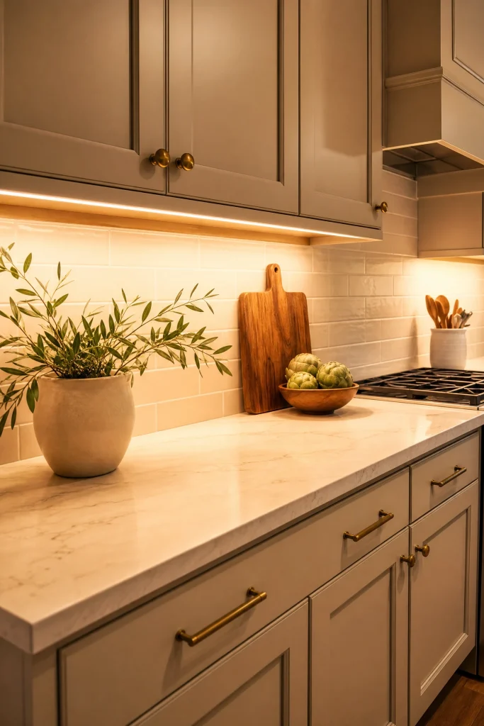
Because Accessible Beige is a mid-tone neutral, it acts like a massive sponge, violently absorbing and reflecting the colors placed directly next to it. If you have a massive, bright red brick wall directly outside your kitchen window, the afternoon sun will bounce off the red brick and cast a terrifying pink hue across your beige cabinets. You must be hyper-aware of these environmental color casts. To combat this, you must heavily utilize crisp white roller shades on the windows to filter the incoming light, neutralizing the outside color pollution before it hits your beautiful paint.
Designer Advice: This reflection rule applies to flooring as well; if you have heavily orange-toned cherry wood floors, the floors will physically reflect orange light upward, completely changing the appearance of the beige lower cabinets.
The Gloss Level Decision
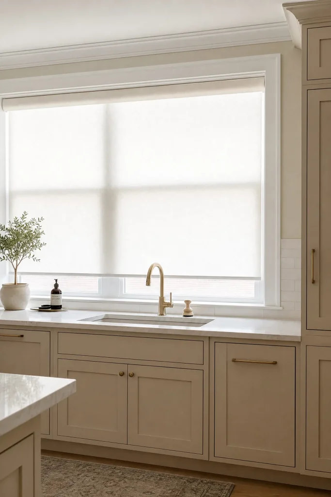
The specific sheen of the paint you choose drastically alters how the color reacts to light. A flat matte finish will absorb light, making the Accessible Beige look incredibly velvety, deeply moody, and significantly darker. However, flat paint is entirely uncleanable and impossible to use in a kitchen. You must explicitly specify a high-quality Satin or Semi-Gloss finish. The subtle sheen will reflect ambient light, making the color appear slightly brighter and much more luminous, while providing a rock-hard, highly durable shell that easily wipes clean of sticky kitchen grease.
Quick Tip: If you are painting over older oak cabinets, a glossy finish will aggressively highlight every single deep wood grain groove; you must use a heavy grain filler before painting to achieve a flawless, smooth modern finish.
Layering Ambient Sconces
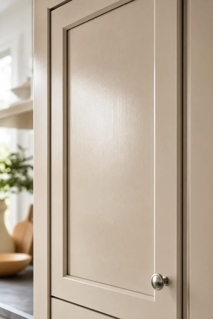
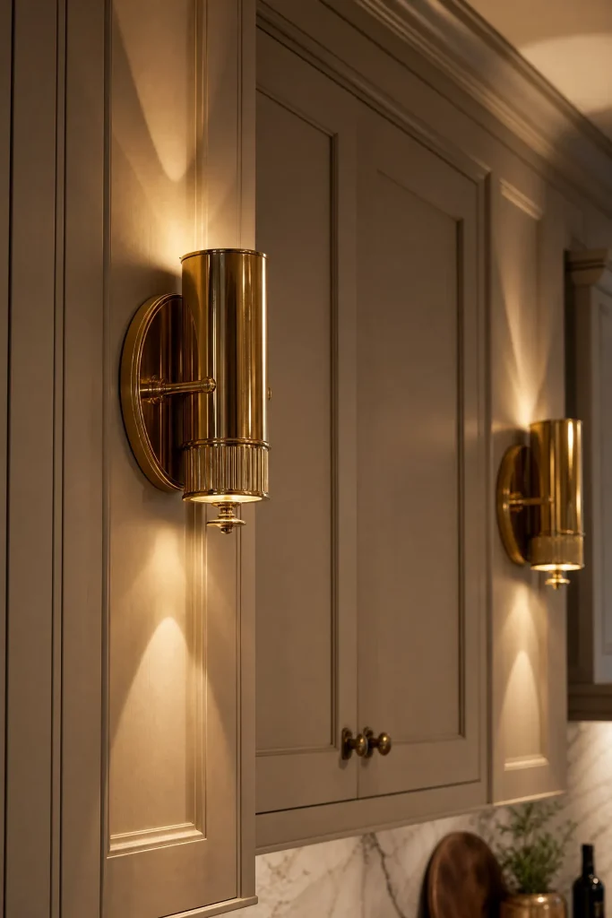
To heavily elevate the perceived luxury of your Accessible Beige cabinetry, you must completely abandon the idea that kitchen lighting only belongs on the ceiling. Installing highly reflective brass or matte black wall sconces directly onto the wooden cabinet face, specifically flanking the kitchen sink or a beautiful window, introduces massive amounts of high-end architectural drama. These glowing fixtures wash the painted wood in a soft, highly localized ambient light, creating complex, beautiful shadow plays that deeply enhance the warm, sophisticated nature of the greige paint.
Sconce Installation Execution:
- You must instruct your electrician to run the electrical wiring behind the drywall before the cabinets are installed.
- Have the cabinet maker drill the exact clearance holes for the sconce wiring directly through the cabinet face.
- Ensure the sconces are mounted precisely at eye level to prevent glaring the light bulbs into your eyes.
Heads Up: You absolutely must select sconces featuring opaque metal shades that direct the light straight down onto the counters, preventing the harsh bare bulbs from blinding you while washing dishes.
The Glass Front Illumination
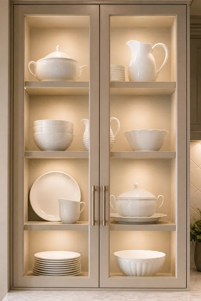
If you utilize glass-front upper cabinets to display beautiful white ceramics or crystal glasses, leaving the inside of the cabinet dark completely ruins the aesthetic, turning the glass boxes into ugly black voids. You must paint the interior back wall of the glass cabinet the exact same Accessible Beige as the exterior, and explicitly install hidden LED puck lights at the very top of the box. The bright light shining down the painted back wall creates a stunning, glowing showcase that heavily highlights the warmth of the paint and adds incredible depth to the entire kitchen.
Reality Check: If you install internal cabinet lighting, you are completely forced to keep the contents of that cabinet impeccably organized forever; you can never again hide messy plastic tupperware in that specific cupboard.
Conclusion
Sherwin-Williams Accessible Beige is not just a simple paint color; it is a highly sophisticated, deeply nuanced architectural tool that requires immense discipline to execute flawlessly. As this Color Theory Matrix demonstrates, you absolutely cannot treat this chameleon color carelessly. You must aggressively control the environmental lighting, strictly pair it with the correct heavy stones and reflective metals, and deploy it strategically to either anchor a two-tone kitchen or create a massive, deeply moody monochromatic envelope. When you respect the delicate gray undertones and harness its immense warmth, Accessible Beige completely abandons its boring, traditional roots. It transforms your kitchen cabinetry into a highly tailored, incredibly bespoke masterpiece that feels deeply historic, flawlessly modern, and infinitely welcoming.
Frequently Asked Questions
Is Accessible Beige too dark for a small kitchen?
It can be, depending on your lighting. With an LRV of 58, it is a mid-tone color. In a tiny kitchen with zero windows, it will feel heavy. To combat this, strictly utilize the two-tone method, painting only the lower cabinets beige and keeping the upper cabinets and walls stark, bright white to maintain a highly airy aesthetic.
Does Accessible Beige look yellow or green?
It is specifically formulated with gray undertones to prevent it from looking yellow. However, because it is a chameleon color, it violently reacts to environmental lighting. In cool, North-facing rooms, it can pull a subtle green hue, while in warm, South-facing afternoon sun, it will look incredibly rich and warmly beige.
What is the best white paint to pair with Accessible Beige?
You must use a warm, creamy white to prevent a jarring, sterile contrast. Sherwin-Williams Alabaster (SW 7008) or White Dove by Benjamin Moore are the absolute best pairings. Avoid stark, cool whites with blue undertones, as they will violently clash with the earthy warmth of the beige.
Can I use Accessible Beige with grey floors?
Yes, this is exactly why the color is so incredibly popular. Because Accessible Beige features distinct gray undertones (making it a ‘greige’), it flawlessly bridges the gap between warm wood tones and cool grey flooring, completely unifying disparate materials in the home.
What color hardware looks best with beige cabinets?
Unlacquered brass is the ultimate designer choice, providing fiery, warm luxury. If you want a strictly modern aesthetic, matte black hardware provides incredible, sharp geometric contrast. Polished nickel provides a highly elegant, slightly glamorous sparkle. You should generally avoid cheap brushed nickel, which can look dated and sterile.
Should I paint the walls the same color as the cabinets?
Yes, executing a monochromatic ‘color drench’ where the walls and cabinets are exactly the same color is a highly avant-garde, deeply luxurious design strategy. It completely blurs architectural boundaries, making the kitchen feel incredibly moody, heavily tailored, and deeply expensive.